
You already have traffic. People are landing on your page. But something is quietly stopping them from becoming customers, and you can’t see it because you look at your own page every day.
That’s the problem with your own eyes: they stop noticing what’s broken.
What a UX audit actually is
Forget the fancy term for a second. A UX audit is someone else looking at your page the way a real visitor does: for the first time, with no context, no patience, and no reason to trust you yet.
It’s not a redesign. It’s not “make it prettier.” It’s finding the exact moments where someone almost buys, almost signs up, almost books a call, and then leaves instead.

Where the money actually leaks
In most audits I do, the problem isn’t one big broken thing. It’s three or four small ones, stacked together:
- The first 5 seconds don’t say what you do. People decide if they’re in the right place before they read a single word of your copy.
- The offer is technically clear, but not clear enough. You know what you sell. A stranger, scrolling on their phone, doesn’t. Not instantly.
- There’s nothing proving you’re legit. No numbers, no names, no proof someone else trusted you and it worked out.
- The ask is bigger than the trust you’ve built. You’re asking for an email, a call, a purchase, before you’ve earned it.
None of these show up in Google Analytics as “bug.” They just show up as people leaving. Quietly. Every day.
A real example
On one audit, a founder had solid traffic and a clean-looking page. Nothing looked “wrong.” But visitors were leaving in seconds.
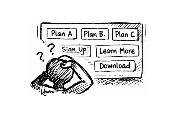
Turned out the hero section explained the how, not the what. Visitors had to scroll and think before they understood what the product actually did for them. By the time they figured it out, most had already left.
Fix took one afternoon. Rewrite the headline, move the value up, cut the explaining. No redesign, no new features, no extra traffic needed. Just removing friction that was already costing conversions.
That’s the part people miss: you often don’t need more visitors. You need to stop losing the ones you already have.
Why this moves revenue, not just “looks”
Say your page converts at 2%. A few fixes that remove real friction can realistically move that to 3% or 4%. On the same traffic, with the same ad spend, that’s not a small win. That’s your existing budget doing meaningfully more work.
You’re not paying for more clicks. You’re paying to stop wasting the ones you already bought.
What to actually look for, if you want to check it yourself first
Before paying anyone, ask honestly:
- Does the first screen say clearly what you do and who it’s for?
- Would a stranger understand your offer in 5 seconds, no scrolling?
- Is there any proof, numbers, names, results, that this actually works?
- Is what you’re asking for (buy, book, sign up) reasonable for how much trust you’ve built so far?
If you hesitate on any of these, that’s probably where you’re losing people.
Why you can’t see your own blind spots
You can catch some of this yourself. You know your business better than anyone. But you also can’t unsee your own page. You already know what it’s supposed to say, so your brain fills in gaps a real visitor won’t.
That’s the actual value of an outside audit. Not more opinions. A second pair of eyes that’s never seen your page before, looking at it the way your actual customers do.
This is exactly what I built BetterIn48 for
I look at your page the way a stranger would, find where people hesitate and drop off, and hand you a clear, specific breakdown of what to fix and why. No guessing, no vague advice, no redesign you don’t need.